At 12/28/25 11:37 AM, Dirkalicious wrote:At 11/1/25 08:32 PM, RobC3 wrote:
I
have
been
honing this look for several years now. I composited my senior film for Pratt Institute, Rat Race, to have this filmic/cel look, and I used a combination of fx macros on Opentoonz, and film grain and shake fx on DaVinci Resolve.
https://www.newgrounds.com/portal/view/948323
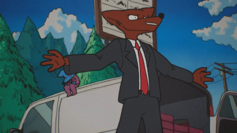
Here's a high quality still from an upcoming animation short I'm working on currently:
NG might compress this image for this forum post, so below is an NG Dump link which has the still captured directly from my Davinci timeline:
https://www.newgrounds.com/dump/item/b2b0ead45e6a815272ff2a3b5a178dc0
Generally I try to keep in mind these elements when doing this look:
Before I get ahead of myself I've been looking to do a write up and tutorial of my process, which would probably entail it's own separate forum thread... Would this be something of interest?
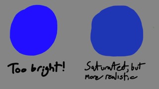
What happens if the colors are very saturated? Like this:
My point on color saturation is just meant to touch on the fact that a computer is capable of producing very bright and saturated color, moreso than what would be possible with the kind of real-life paint that would have been applied to classic animation cels. It's why in the printing business their computers are calibrated to work within the same CMYK color system that printers use, as opposed to the RGB system computer screens use. That way a print designer won't accidentally use a color that a printer is unable to reproduce.

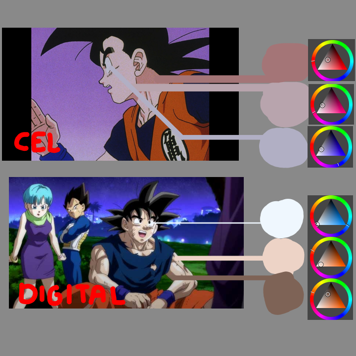
Next to saturation, the contrast between the palletes is arguably more important.

There's a bit of an optical illusion going on. In a vacuum, the cel animation colors can appear striking! But, when you take an eyedropper tool and analyze them, you realize "Hey, the midtones and the shadow colors aren't really that far off from each other!". And next to that, the cel image is quite dark too at the same time. Cel animation art is capable of having the appearance of strong contrast while actually displaying not very much (in comparison to digital art). More to that point, you can see that the pure black paint used for Goku's hair in the cel image, doesn't even appear as pure black when scanned in!
This is not to say that film isn't capable of capturing bright and vivid color, it certainly can. But in that celluloid animation process, the drawings were just simple paintings photographed in a lit room, I'm not even sure how bright it would have been in the photography-capturing room of a studio.
Also, miscellaneously but still important, take into account that a digital remaster of a cel-animated show or movie may almost certainly touch up the colors during the remastering process to appear more deep and vivid.


