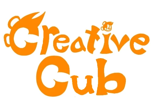
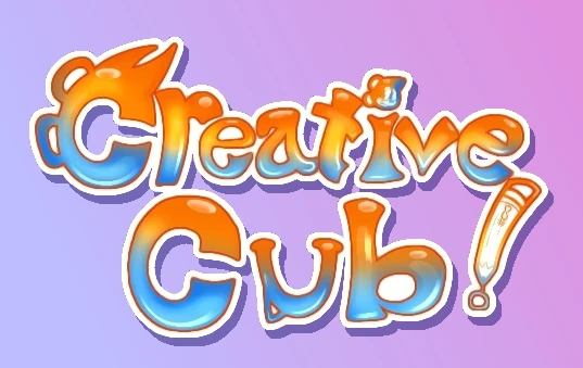
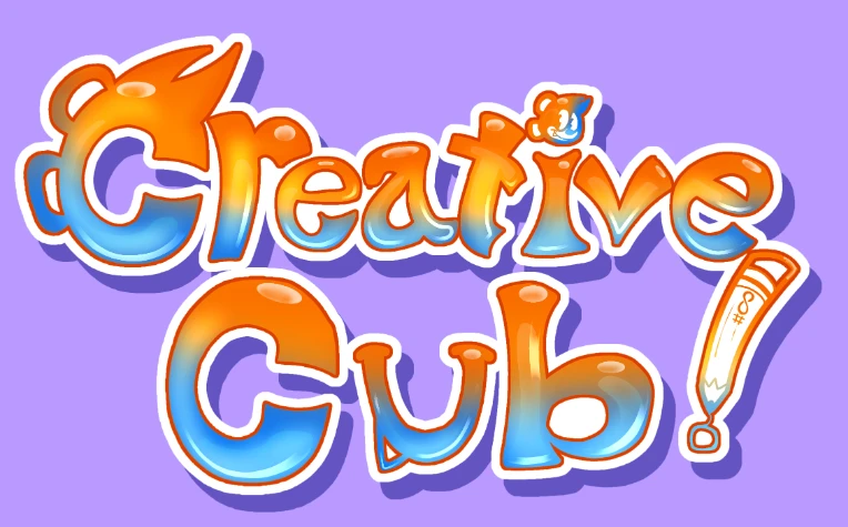
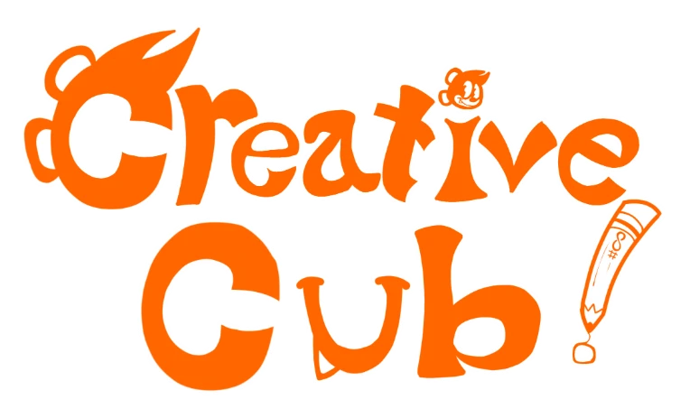
I'm a huge fan of how fun the logo looks!!!!! If that's your intent, I'd say you did a pretty good job.
The one thing I'd change is to make the letter strokes a lot more consistent. As it stands, the widths of the strokes vary a lot which can kind of screw with legibility.
Here's my shot at tweaking the logo in MS Paint:

Most I did was just made the U in Cub smaller and thicker, among other strokes. I also just tweaked the kerning (space between letters) to be a little tighter!!!
At 1/16/26 01:15 PM, PerKGrok wrote:At 1/16/26 03:13 AM, CreativeCub wrote:This is the logo I'm working on rn. Critiques and suggestions are greatly encouraged!
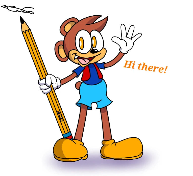
and this image below is what he looks like. He's a superhero with powers based on cartoon logic. He can also draw almost anything to life with that big ol' pencil of his. His personality can be described as wacky, witty, silly and most importantly, he's deeply kind hearted and charitable
The idea for the logo is good. It should be a bit more consistent and thighter, in my opinion.
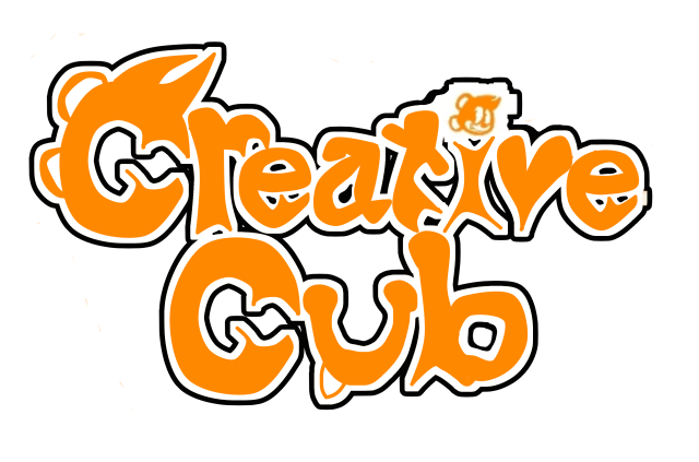
I fieddeled around a bit and this was the tweaked version I came up with.
This is frankly terrible. The black outlines end up making the logo look a lot more visually noisy in comparison to the original. Spaces between specific strokes of characters have been reduced (like the space between the lowercase e's) making it less legible. For whatever reason you also just decided to distort the characters' shapes.
I personally like to restrict the outlines to the outside edges of the logo only, and fill up any inside spots with the color of the outline.

At 1/17/26 12:05 AM, Zfert wrote:I can tell you put a lot of thought into each of the letters, but it doesn't really work as a logo. It's very busy and will not read well on smaller print or screens, which removes your ability to use it on anything like a business card or as a watermark. Details like the character's face in the letter 'I' and the tooth(?) on the letter 'U' are already hard to see clearly on the screenshots you provided. [...]
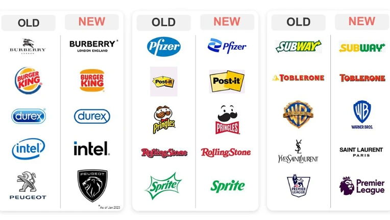
I think the little details are kind of the point. The guy pretty clearly said the logo was made "as a middle finger to the corporate minimalism going on in most media nowadays". It kind of harkens back to a time when logos had a lot more detail going into them and weren't designed to work as an app icon and whatever.

Understandably it doesn't work when put on a business card or something, but again, not really the intent anyway. If it were, they would've made a logo that was a lot more clear and sanitized.
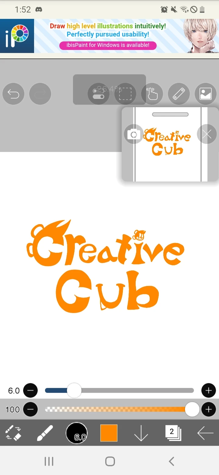


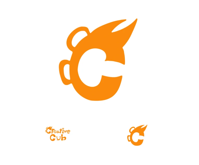

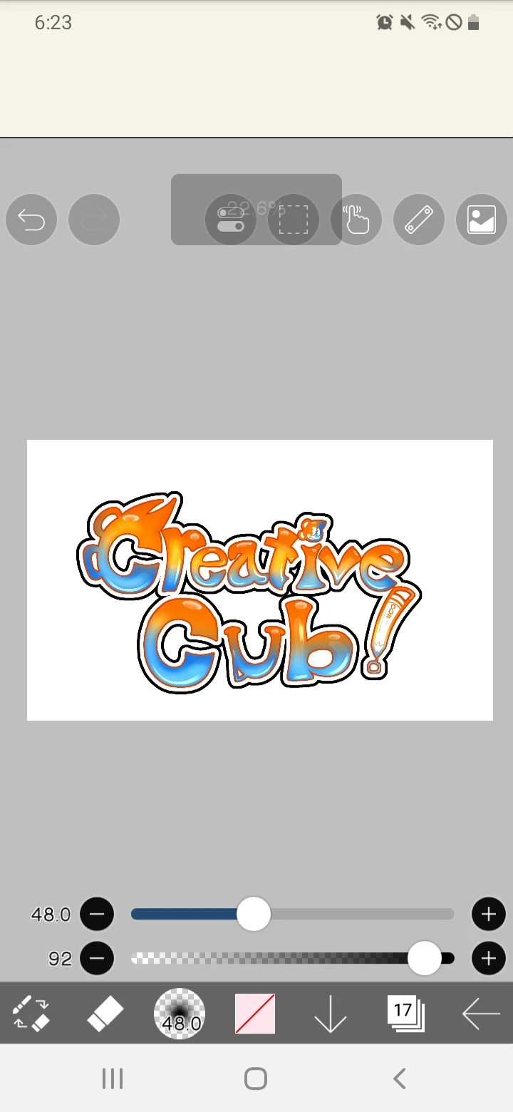
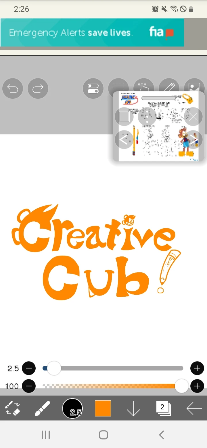 This is what the logo looks like as of now as I'm typing this. Someone in a discord server suggested I add Creative's signature Stylee (pencil) as an exclamation point