
179 Forum Posts by "Dirkalicious"
At 1/18/26 07:43 PM, jthrash wrote:Got this idea from perhaps the first half-decent recommendation YouTube has given me in years, ironically, but it explains quite a bit why I'm ironically getting hundreds more views on Newground's Movie Portal alone than the supposedly-more-mainstream YouTube:
So I'm sure many of you are like me in that you upload on YouTube in addition to Newgrounds' Movie Portal just to reach more people, especially people who for whatever reason still see Newgrounds as the stereotypical "edgy" website and feel more comfortable on the more-mainstream YouTube as a result. Even if you don't post on YouTube, you probably like going to YouTube for tutorials and video essays and probably have noticed that your favorite animators or long-form content creators don't seem to post on YouTube nearly as much as they used to, or the recommendations from YouTube itself seem to have gotten worse and worse despite all the data the website collects just to tailor the recommendations and especially ads towards you.
Now as someone who hardly ever treated YouTube like a full-time job and certainly never made money off my videos, but still seemed to do surprisingly well when I first joined at only 16, uploading amateurish garbage and still somehow getting 200-500 views per video this overall drop in views I've gotten over the years despite improving my skills and still mustering 200-500 views in the Newgrounds versions of the same videos can create a serious sense of "Imposter Syndrome."
Am I out of touch compared to when I first started making YouTube videos at 16? Possible, I don't think I've understood "the kids" since memes like Skibidi Toilet and "Six-Seven" became popular, but on the other hand, I could easily make up for it by overall being more competent at what I do than when I was a dumb teen myself, and of course at 31 I'm not THAT old, yet. And, of course, if I'm lucky I could actually create cool trends and memes similar to how SpongeBob seasons 1-3 basically predicted modern meme culture just by being as funny as the writers possibly could muster at the time.
Is my stuff not good enough for the algorithm? Partly true, if I'm being honest. I've always struggled with sticking with one specialty until I'm absolutely great at it, not just "good" or "competent", and for my latest Punk n' Gunk cartoon, I've received some very good feedback on how I could make my animation less...unintentionally-terrifying to look at. But that doesn't explain how the YouTube version couldn't even muster 27 views while the Newgrounds version got over 100 views, a few 5-star ratings from my most loyal fans here, and maintains my usual average of getting 3-3.5 stars for every Movie Portal submission that I actually put a ton of work into. Or when I shared the link on the even-more-niche Blender Artists forum, it managed to get two "Likes," which was still two more "Likes" and general engagement than I got on the YouTube version.
While I think it's good to take responsibility for your own YouTube channel's decline and figure out ways to make your animation more polished for mainstream audiences, with these Web 2.0 social media sites and their ever-changing algorithms, you should also recognize that sometimes, it's just not your fault that junk you made as an amateurish teen got more views back in the day than more-competent stuff you make now. If you haven't had time to watch the video above (but somehow had the time to read all these walls of text--I'm sorry, that's just how I am on the forums), it basically says YouTube's algorithm and UI has quietly-but-drastically changed to prioritize vertical "YouTube Shorts" content over horizontal "regular" YouTube videos, even the short horizontal videos, and even hugely-popular channels that mostly prioritize horizontal videos, like Mr. Beast, have seen a huge and impossible-to-ignore drop-off in views and general engagement since this particular change.
Basically YouTube has inevitably become a sadder version of TikTok. Or Instagram Reels.
I can actually see the upsides of this as someone who specializes in animated videos. Animation takes absolutely forever to make (even poor animation takes a ton of time), yet these algorithm-based sites reward you for uploading fast and constantly. By prioritizing shorter stuff, this could give animators a fighting chance on YouTube again by making a lot of 10-second animations, rather than spend months and months on an animation, only to not even get views from your own irl family and friends.
THE PROBLEM, unfortunately, is that YouTube's algorithm changes also hurt the chances of Shorts consistently getting views, according the video. It has a strong "recency bias." Basically, if you upload a Short and the almighty algorithm decides to show it to a ton of people, you could get way more views than you're used to getting in less than 24 hours--personally, I've gotten around 1,000-2,000 views on Shorts when I got lucky like that. BUT, if your Short flies under the algorithm's radar in the first 24 hours since it was uploaded, then your views on that particular video will be in the single digits and stay there forever because the algorithm also never again shows Shorts made more than 24 hours ago to potential viewers--so the answer is not as simple as "upload more Shorts and less horizontal videos," especially when you also account for AI slop flooding YT Shorts the same way they already flood TikTok and other short-form websites, or that your more intellectual fans who fear short-form content is making humanity dumber likely have an ad-blocker or extension that ensures they won't ever see the YouTube Shorts feed at all on their YouTube account.
This could very well spell the end of YouTube itself if they don't remind themselves that YT was always at its best as a long-form video platform where people could actually make a career out of simply making high-quality YouTube videos everyone wants to watch. At least we animators have the Newgrounds Movie Portal as an alternative that not only also supports long animation uploads, but actively encourages longer animations--if YouTube no longer exists for other long-form content, like comprehensive Blender 3D tutorials, thoughtful video essays or accessible archives of lost/forgotten media dating back to the 1800's, where else could we turn to?
As it stands, I'll still (reluctantly) use YouTube, even for re-uploading my longer Movie Portal Animations, just so that I can easily share video links to my family and friends, as well as other websites like Blender Artists forums, Discord, LinkedIn and other websites that otherwise don't have the bandwidth for videos longer than 1 or 2 minutes. But yeah, YouTube is weirder than ever these days, and you probably shouldn't beat yourself up if your views and subscribers on that site just plummet for no good reason, especially for standard horizontal videos more than 2 minutes long. You certainly shouldn't use YouTube as a potential stable career path, or expect to get your animated pilot picked up by a major Hollywood studio, however.
I did notice that, many of my shorts get 1k+ views on average while my YouTube videos only get 10-50 views if I'm lucky
Here
I'd KILL for you to draw these guys !!
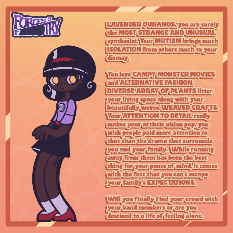
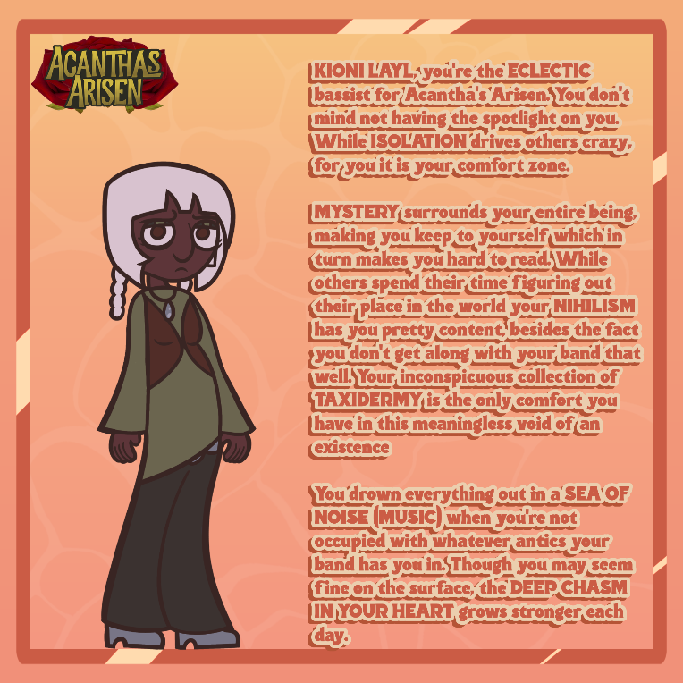
(Those circle things on Kioni's hair are braids, also Lavender's fingers are long because of a condition she has)
At 1/18/26 05:53 AM, PsychoStatic12 wrote:I'm starting with mine since I don't know:
mmmm the comparison is moreso related to the colour palettes n not so much the characters, but the colours remind me of great god grove , very warm coloured with greenish-orange skies the artstyle itself bares a very faint similarity with the original smile for me artstyle , base level comparison coming from simple shape usage but with much thicker lines, the fine colour abbirition of the lineart in the first image gives way to that comparison a wee bit more however lol
the style as a whole reminds me very loosley of something trying to mimic the aura of an early-mid 2010s show that aired on smth like kix but I honest to god cannot put my finger quite on what specifically comes to mind...
so for now I leave it as lol
My turn!!!
exhibit A Character designs
Exhibit B , general bit of art
(If you need any more examples come to my art page or my toyhouse gallery teehee)
Ive heard manya things before about my style, lets see if anyone here can give me smth new lol 🌈
The way you draw eyes reminds me a lot of the Littlest pet shop show, along with your character designs and specifically the wild proportions reminds me of the movie Klaus. I'll also say that something about the coloring and faces reminds me of the movie adaptation of Nimona. Your artstyle varies a lot but this is what I can take from your average piece. You def take a heavy inspiration from Lauren Faust, really thinking of MLP:FIM and Galaxy Girls with some of your designs specifically the animal ones.
This is a thread for people who wanna know what their art style is and media that shares a similar look. You comment with your art below and try to answer the comment above, this is meant to be a reciprocal thread so it stays fun.
I'm starting with mine since I don't know:
Storyboarding, knowing where the characters are helps me come up with the script
Ok guys, no more. I still have to have time to put in all the credits
Not taking anymore submissions !! Time is up, I'll upload in 3 hours
At 1/15/26 09:09 AM, Sockrocket wrote:can i enter a thing today?
Sure
I will NOT be taking any more submissions after 11am est on the 15th (tomorrow / today), I will close the thread by then because the sheer amount of people needing to be added will be a lot for me to account for. If I don't get all of you when I upload, don't worry cause I can always add you as a credit later just dm me if I missed you so I know to add you in afterwards. I will be busy so it might take some time to have everything in order.
At 1/14/26 09:38 PM, Saffronette wrote:Do the submissions end as soon as it's the 15th or before the 16th? I'm still working on mine.
I'm submitting this thing on 2pm est tomorrow so you have before then
I downloaded all the clowns here so far and I'm already arranging them, just gonna say that it's a TIGHT fit 😭
About 74 clowns are in this collab
At 1/11/26 11:42 PM, Oxim wrote:
Grunfus the Dancin Clown
It's a mix of Grunfus (One Night at Flumptys) + Pennywise (It)
Do you have a clear render version of this?
At 1/14/26 04:49 AM, PsychoStatic12 wrote:I should've clarified it's the pose and hair, the shoe is lined differently cause I need reference for where it's at. I'm also changing the shape of the sleeves from now on and in this drawing he's not supposed to have those joint lines because it's a version of him as a fairy instead of a ventriloquist dummy
lord! thats quite a lot of missing context! lmao i think you should clarify at least some of these notes in the first post before making feedback threads
I see, i getcha tho now, I still think the legs are a bit too thick and short (primarily the one behind the front leg) and the front leg looks like its kicked just a bit too far up his bum lol i think just lengthening them should kill two birds with one stone tho as it should make the legs look less stocky
I dont know what to say about the hand/arm given that is not been drawn in yet, im guessing the characters supposed to be discussing, or arguing something to another character? the intentions are currently unclear so i cant say much in regards to that
and the head still feels rather unclear, maybe its just me, but the picture below is how im currently reading it I know the hair would swoop over a bit so it might make the facial features look a bit closer together than they normally are but I still think theres room for a little more width in the front of the face
Yeah that's a swoop, the yellow is the inner side of the hair
At 1/14/26 04:34 AM, PsychoStatic12 wrote:oh dear, again your being very vauge in what you want "fixed" about this piece lol
whats the main issue here?
im spotting a few potential issues here but i dont know whats your main concern right now? ill note some things that im seein tho-
her eyebrows and both legs look really thick in the 1st drawing
said legs are also missing a line joint (for her knees)
the tips of her shoes are lined when in the main/reference pic they arent
I also dont think youd see the curve of her hair from this angle, it makes her forehead look bigger than it needs to be
that, and the sleeves of her shirt are the wrong shape.
about the head thing id probably recommend making her head just a bit wider to 1, fit her reference headshape a bit more and 2, give a little more room for her facial features to breathe
hope this doesnt come across as too rude , just thought id throw some points of interest
I should've clarified it's the pose and hair, the shoe is lined differently cause I need reference for where it's at. I'm also changing the shape of the sleeves from now on and in this drawing he's not supposed to have those joint lines because it's a version of him as a fairy instead of a ventriloquist dummy
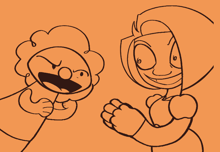
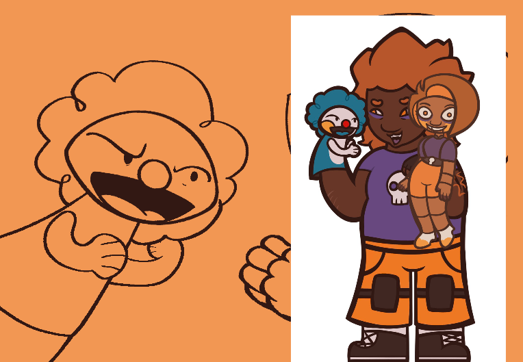
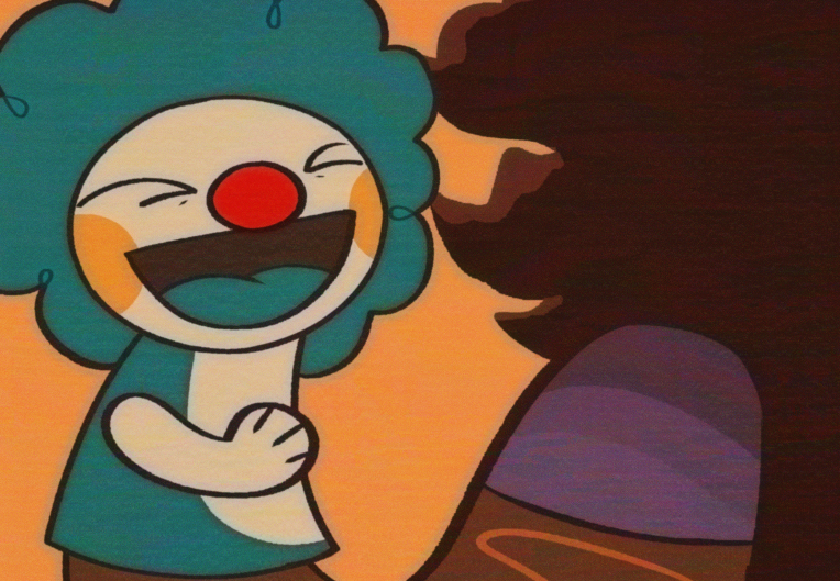
An alien clown tv head with a seal or bear motif, plus sized / fat and short
 Here's my clown guy
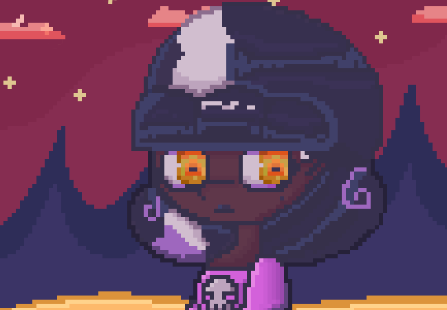
Is this good? This is my first time drawing pixel art
Is this proportionally correct and if not then what do I fix?
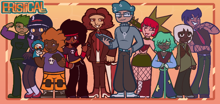
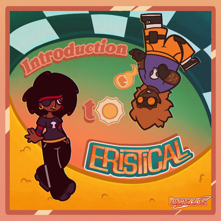
First panel for my web-comic, Eristical
At 1/11/26 01:00 AM, Br00talD00dle wrote:At 12/22/25 01:31 AM, Dirkalicious wrote:Can you draw my horrible abuser character getting his ass beat
Julian learns the hard way when they put the "grrr" in "riot grrrl"
https://www.newgrounds.com/art/view/br00tald00dle/abuser-down
YESSSSSSSSSSSS LETS FUCKING GOOOOOOOOOOOOO
Does anyone make flashes for MSPFAs / animations? Or even basic animation using drawn assets?
At 1/9/26 05:21 PM, Br00talD00dle wrote:At 12/22/25 01:31 AM, Dirkalicious wrote:Can you draw my horrible abuser character getting his ass beat
If a whoopin' is what he needs, a whoopin' is what he'll get!
Who's delivering the pain?
Any additional details before I start?
Just pick which ever characters from this cast, I'd love to see his glasses get cracked ala Equius in Homestuck Murderstuck arc
At 1/7/26 03:58 PM, Vinity wrote:At 1/7/26 03:41 PM, Dirkalicious wrote:At 1/7/26 12:39 PM, Vinity wrote:How about this?At 1/7/26 12:30 PM, Dirkalicious wrote:At 1/7/26 11:12 AM, Vinity wrote:So you want to replicate the famous UPA style? In that case, and with any other style, study and practice it. "Replicating" isn't something that happens overnight. Analyze the UPA style and its characteristics to then apply them to your own style. If you want to have a greater resemblance to it, consider having a limited color palette, using tools to smooth strokes, having lines of different thicknesses, knowing how to implement colors, not overusing gradients, and partially drawing in a somewhat chaotic way. This last point is because things tend to be intentionally imperfect due to the stylized approach, which gives a sense of liberation. The prefabricated shapes will be helpful (and copy+paste). Also, consider two-dimensional shapes and 2D spaces; the UPA style doesn't usually aim to give the sensation of three-dimensionality. So keep that in mind.
Obviously I don't wanna 100% imitate it cause I still want my own thing but is this good so far?
So far it's going really well. The only thing I would change are the loose strokes. Keep the lines connected and clean. But other than that, it's great.
For your style, it's fine.
But if you want to get closer to the UPA style, consider tilting the buildings in the background and giving the ground a less saturated, more muted (opaque or pale) color. Otherwise, it could stay as is.
Oh yeah I should tilt the buildings
At 1/7/26 12:39 PM, Vinity wrote:At 1/7/26 12:30 PM, Dirkalicious wrote:At 1/7/26 11:12 AM, Vinity wrote:So you want to replicate the famous UPA style? In that case, and with any other style, study and practice it. "Replicating" isn't something that happens overnight. Analyze the UPA style and its characteristics to then apply them to your own style. If you want to have a greater resemblance to it, consider having a limited color palette, using tools to smooth strokes, having lines of different thicknesses, knowing how to implement colors, not overusing gradients, and partially drawing in a somewhat chaotic way. This last point is because things tend to be intentionally imperfect due to the stylized approach, which gives a sense of liberation. The prefabricated shapes will be helpful (and copy+paste). Also, consider two-dimensional shapes and 2D spaces; the UPA style doesn't usually aim to give the sensation of three-dimensionality. So keep that in mind.
Obviously I don't wanna 100% imitate it cause I still want my own thing but is this good so far?
So far it's going really well. The only thing I would change are the loose strokes. Keep the lines connected and clean. But other than that, it's great.
How about this?
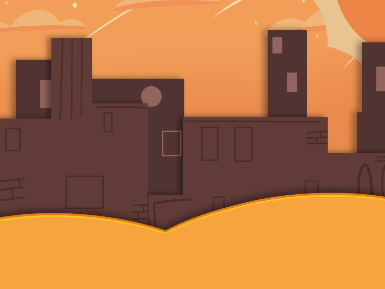
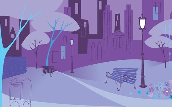
At 1/7/26 12:25 PM, PsychoStatic12 wrote:Both drawings are mine but I'd love for the backgrounds I draw of nature to fit the same vibes as the background I drew of the room
gonna be real, thats still quite vauge lol but luckily I see theres a little extra context from when vinity chimed in, im sure shes probably said a majority of the things youd need to do to achieve a more UPA esque style, but yeah
Id recommend using a lasso tool to block out simple shapes for things such as trees and clouds, and maybe just some simple square tools (with some tilting) to get the basepoint for the buildings
Id also keep the gradients and the lineart to a minimum, only using that to block out things like windows or defining lines
for the most part ur thinking in simple, geometric shapes, with some slight slants to add a bit of cartoonish flare to said elements
((sorry for late reply, was at college lol))
Yeah, I'll try that? It helps to basically rush it cause I have the tendency of adding a lot of detail so it forces me to boil it down and focus my priorities
At 1/7/26 11:12 AM, Vinity wrote:So you want to replicate the famous UPA style? In that case, and with any other style, study and practice it. "Replicating" isn't something that happens overnight. Analyze the UPA style and its characteristics to then apply them to your own style. If you want to have a greater resemblance to it, consider having a limited color palette, using tools to smooth strokes, having lines of different thicknesses, knowing how to implement colors, not overusing gradients, and partially drawing in a somewhat chaotic way. This last point is because things tend to be intentionally imperfect due to the stylized approach, which gives a sense of liberation. The prefabricated shapes will be helpful (and copy+paste). Also, consider two-dimensional shapes and 2D spaces; the UPA style doesn't usually aim to give the sensation of three-dimensionality. So keep that in mind.
Obviously I don't wanna 100% imitate it cause I still want my own thing but is this good so far?
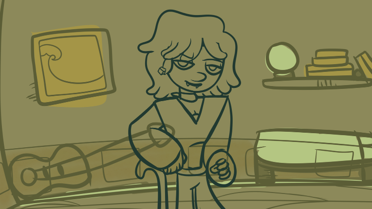
At 1/7/26 05:54 AM, Kecchi wrote:Try finishing what you started for the indoor background. It's kind of easier to give advice when there's more to work with. I assume that what you have so far is just a WIP while the one below is complete (or closer to completion at least).
The first thing you can do that would take you a long way is to use colors that "match the vibe" of the outdoor background. I see that the outdoor scene uses very saturated colors. However, the green you use indoors seems more desaturated and darker which is kind of at odds with the style you established for the outdoor scene. Maybe a green closer to lime green would be more suitable.
Other than that, it is kind of hard to tell what you should do from the outdoor background you chose here alone. The scene is pretty simple so there's not a lot of visual cues on how you approach shading and drawing objects.
For the background, I'm trying to go more for this vibe
Sort of like Dexter's lab and ppg, the issue is Im struggling with carrying that sort of style over to my backgrounds outside of building interiors


