
4,456 Forum Posts by "Oddlem"
At 1/15/26 11:05 AM, Skoops wrote:A little behind, but I'll catch up. EAT FASTER.
I want to eat a burger now 😭
Like the other person said, this type of stuff should go in an art thread! There’s been some confusion in the past, so I want to clarify that it’s basically just making just one thread and updating to that
And here’s an example:
Found lots of cool stuff today
This is a really good idea!! The critique thread we have didn't really work out, but I think having a personal thread like this is a really nice middleground
I've never done 3D otherwise I'd pop in and give advice, BUT I'll keep checking this out and give some feedback if you need any critique/help with 2D stuff!
I will also say, like others mentioned, tutorials like those are designed for beginners. Maybe they do help, maybe not, but at some point it's better to break away and do your own studies/experiments. IMO the people who make tutorials are teaching bad practices half the time, not just art but in other disciplines too like programming. The sooner you stay away from those, the better
If you want to scratch the same itch, you could find some art books that teach theory! But honestly, I think that's why it's so nice to have a community like in here where you can do some studies, apply them to your art, then ask for feedback. That's 100000x more valuable than some frickhead on youtube who has no idea what they're talking about. Those videos are supposed to be for those people who just want to dip their toe in before they start picking up art as a hobby, not people who already have started
Yeah I think these feedback posts are getting a little excessive and it’s not super clear in the start of the post what you need help with. It’s fine to ask for feedback every once in a while, but not this often
Could you start putting these in one thread somehow? Maybe a thread on this project and you ask for feedback there. Because I think this is the third or fourth post in the month of January alone
At 1/13/26 08:37 PM, Skoops wrote:I haven't really started yet, but at some point this year I'm considering dipping my toe into the loathsome and soul-deadening realm of public commissions to see if I still hate it as much as I used to. Partly to give myself a challenge and produce more work that I can post, partly so I can better advise others on it now that the world's been flip turned upside down. I think I'm losing touch and I'd like to un-lose it.
Ooh nice, commissions can be a double sided coin cause on one hand the deadlines give you that push to make more stuff, but also accepting too many adds a lot of pressure. I hope it all goes well!! If you can get a vgen inv tho that helps a LOT from what I've seen
At 1/13/26 09:46 AM, Miss-Lucy wrote:At 1/13/26 09:44 AM, Oddlem wrote:At 1/13/26 09:33 AM, Miss-Lucy wrote:yeah I read it. Honestly, This is valid, but it makes me sad. I wanted to give me my sister support on NG. She is a great artist :(
Aww no I understand, I'm sorry! I'm not sure what the circumstances are, but if it's just because she's hesitant to sign up and not a minor maybe you could convince her? I feel like newgrounds gets a lot of bad rep and I've had that happen with friends 😭
my sister is 22. And I don’t think she would be a fan of joining NG
Fair! I hope she’s able to find a way to share her stuff either way
At 1/13/26 09:40 AM, Enzo-a-person wrote:
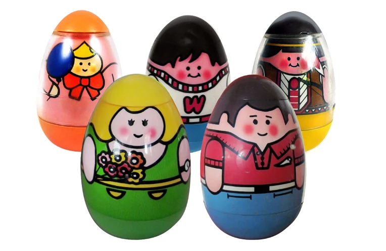
Nerd who is madly in love with his best friend who is madly in love with another guy who is madly in love with another guy who is madly in love with him. (Created him a few days ago so all I have are some sketches).
It's like one of those little egg guys but for love triangles
At 1/13/26 09:33 AM, Miss-Lucy wrote:yeah I read it. Honestly, This is valid, but it makes me sad. I wanted to give me my sister support on NG. She is a great artist :(
Aww no I understand, I'm sorry! I'm not sure what the circumstances are, but if it's just because she's hesitant to sign up and not a minor maybe you could convince her? I feel like newgrounds gets a lot of bad rep and I've had that happen with friends 😭
At 1/13/26 09:19 AM, xeiavica wrote:At 1/13/26 09:18 AM, Miss-Lucy wrote:You're probably fine to post it on your news posts if you head over to your public profile. Or maybe in the general art offtopic thread.At 1/13/26 09:17 AM, Oddlem wrote:I'm not the one who deleted it, but if your sister drew it and you're uploading what she drew, that wouldn't be allowed
Whatever you upload would have to be made by you
I figured that
Yeah those would be fine, this rule would mainly be for the art portal. The off topic chat is here btw OP: https://www.newgrounds.com/bbs/topic/1533604/1
I'm not the one who deleted it, but if your sister drew it and you're uploading what she drew, that wouldn't be allowed
Whatever you upload would have to be made by you
Girls mom leaves for milk and cigarettes, girl forms a friend group with a bunch of monster people
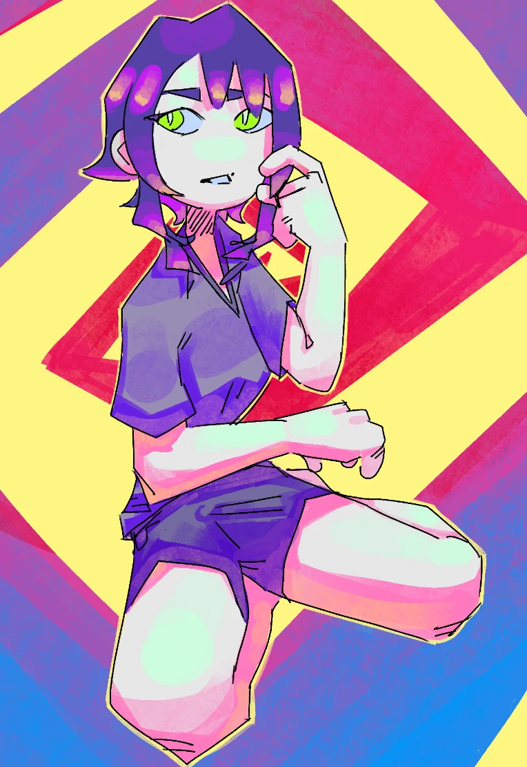
At 1/12/26 10:36 PM, SquigglyV wrote:Compositionally I think the first image looks fine, the yellow outline around the character separates them nicely from the background and that spiral does a good job at drawing the eyes in without being a distraction. I'd never say the amount of colour is a problem!
It definitely seems overly bright and washed out though on their skin, I can just barely tell there's some highlights but they really get lost and don't help much because the base colour is so bright.
A small thing I've found in my attempts to get better at contrast/values is that, assuming they're lit normally, the whites of people's eyes make a good benchmark for where the brightest part of a character should be before shading (i.e. highlights and glowing parts can still be brighter, but base tones probably shouldn't be). That goes for both clothes and, as in this case, very pale skin.
Here the eyes are pretty dim, they look like they're in a shadow, you could bump them up but you'd sacrifice your highlights (and the irises if they're meant to be lit up) so I'd bring everything else down a little instead. Something I'm learning myself is that strong highlights necessitate a bit of self-restraint in palette, they're meant to help things stand out so if everything already stands out then it won't do much lol.
Thank you for giving a critique!! And giving a critique on both!!
I see what you mean though, I feel like everything you said is spot on. I didn’t notice that about the whites of her eyes!
Also, by move everything down do you mean dim just the mid tones? Or like everything-everything?
But either way that does make sense and that’s what I was feeling too, that the contrast was too harsh 🤔 I didn’t pay any attention to the highlights though LOL, that also makes sense!
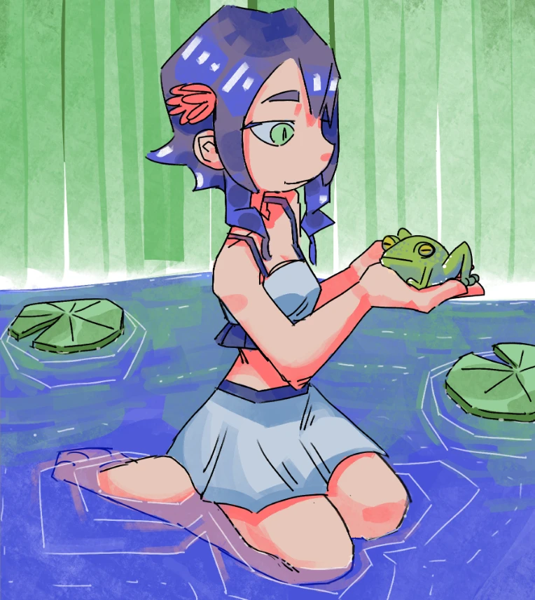
The second image is really nice, I wouldn't change the framing on that one either. The posing doesn't seem like an issue, although I wouldn't have noticed what you were going for with their left leg, it looks like they're just sitting flat to me (but in a natural way).
If you have a mirror or a camera, you can totally use yourself as a proper reference! I do that a lot especially for anatomy.
I used to actually!! I try to use my camera for arms and hands, but for stuff like poses it’s weird. I’d have to ask someone to take the picture but then the angle changes, or it’s tilted slightly too far in one direction
Perspective-wise, it seems like their head and shoulders are in line with the background but everything else is sitting flatter against a more distant horizon. It's not really obvious especially with how they're turning to the left but I did notice it while typing this up.
Good eye, I didn’t notice either till now but you’re right 🤔 I did have some other problems with perspective in the beginning, I think that was left over and didn’t fix it to also align with the horizon
Otherwise there's just a couple of minor things if I look really hard. Their thumb seems very long proportionally, it almost looks like an index finger as drawn. And their legs might be a little short but I am unsure, I do agree that there's something about the right foot/ankle which seems off but I can't tell what.
NOOOO, I’m dumb I didn’t realize the thumbs would be facing the camera LOL
I think I may be dyslexic, I try figure out where the thumbs are by moving my hands in the same pose IRL and I think I just flipped it in my head somehow 😭😭
Very pretty overall, your style feels like digital watercolour.
I’m glad you feel that way!! I tried getting it to look more watercolor-y so it’s good to hear that!! I still have some stuff to improve on but I’m happy to hear that overall it still worked out
Thank you again for giving TWO critiques!! It helps a ton, I definitely know what I need to focus on next time lol
At 1/13/26 12:48 AM, PerKGrok wrote:W sitting
YEAHH that looks way more accurate!! BUT now that I’m looking at it, maybe her current pose fits better with the composition and it accidentally worked better
Either way it helps though seeing your edit!! I was very off lol
At 1/12/26 08:02 PM, xeiavica wrote:At 1/12/26 06:47 PM, Oddlem wrote:Like everyone else said, the forums are moreso formatted to make one thread and keep updating it as you go. Thank you everyone for sending OP so many images and helping them out!! That was really kind of you allI'm getting the distinctive feeling this thread was made to mock thread trends in the art forum. Hence why a lot of others were doing so as well.
I'm not sure if you'd like to make a new thread just for art and lock this one, or turn this one into an art thread, so I'll keep this unlocked for now
Wait really? I didn't pick up on that at all lol, I thought everyone wanted to chime in and help OP :') Oh well!!
At 1/12/26 07:41 PM, Purrichi wrote:my suggestions would be to add a frame or some background element that’s straight/structured to add some contrast to the composition. First one is just a black frame around the bg. I think the darker color kinda cuts into the brightness of the bg and helps the character pop more.
This definitely would have been good to do in hindsight, yeah that adds way more balance!!
in the second one I used a dark grey instead of black, made the frame uneven to kinda match the tilted look of the bg, and moved the figure to the side so it was less centered. I also added the skin tone as an overlay over the bg to see if it would harmonize the bg colors with the figure more. I like it but I think both palettes look good tbh.
WAITTT that's a really good point!! I was actually trying to mess around with the spiral before and change its positioning, but I couldn't get it to look good. That's way way better
Hope this was helpful!
IT WASS thank you!!
I know we have a critique thread but... to be honest, I've posted there and it's pretty dead (I don't think I get responses a lot of the time, and if I do it's like 1 person). It's a lil bit a weird gray area I feel, so I'm just gonna make a separate one. I don't really enforce using it anyway so EH!!
Anyway!! I've been keeping up with my goal to draw more digital art, and wanted some critique on these newer art. My goal is to improve with my color composition and, well, the overall composition I guess! You also by no means have to critique both (that'd take a LOT of time to write up! so no pressure!)
In this one I used grays for the midtones, and saturated colors for the shades. I tried to keep the main colors as purple + yellow, with some small accents of green, blue, and red. I'm mostly concerned about contrast (if what I did made it too bright), and whether I made it too busy by introducing too many colors
And this one is more unfinished, but finished enough to where I want some feedback. I wanted to experiment more with having mostly vivid/saturated colors, kept the main color pallet as blue/green with some red accents (tho idk if I overdid it with the red lol). Does the overall composition flow well? Also, how is the perspective on the character? I wanted to raise her left leg slightly so it implies the river is bumpy, but I didn't actually define any shapes in the water so I'm not sure if it just makes her look like she's floating on nothing.
I also feel like her right leg might look off. I sit like that irl but it's really hard to get references, so I went off of what I feel I look like when I sit down. She's not sitting on top of it, it's more just to the side and facing up. Apparently it's called W sitting? All the images on google are toddlers which is unfortunate 😭
Like everyone else said, the forums are moreso formatted to make one thread and keep updating it as you go. Thank you everyone for sending OP so many images and helping them out!! That was really kind of you all
I'm not sure if you'd like to make a new thread just for art and lock this one, or turn this one into an art thread, so I'll keep this unlocked for now
At 1/12/26 09:17 AM, SouSTAR wrote:At 1/12/26 08:41 AM, Oddlem wrote:two things come to mind: you don’t need to feel passion or inspiration for the stuff you draw. I’m not sure how other people feel, but I don’t feel like everyone feels that way all the time! I think that does hit people in bursts, though I could totally be wrong but that’s what I’ve observed
And then the other thing: what does make you feel that strong passion? I feel the same way in a sense that I don’t feel that burning passion over drawing. But drawing fuels that for other stuff, like storytelling, character design, worldbuilding. Making a game too, caused me to feel that. And I think that’s normal! To not necessarily feel that way over the subject matter
I’d say experiment with other stuff you might like, and see how you can use them together
Its really early in the morning so I might’ve misread, but that’s my 2 cents
To answer your question: i don't really know. I just remember that prior 2024 (before having an account), i used to make a lot of comics for myself. Spent weeks/months drawing and writing about the characters (without writing the comic lol).
I was content with what i did and "felt passionate".
For instance : One comic i had was a duo of cops int he 1990s. So i began to watch the COP's show, listening to Funk, reading old manga, practicing the style of old manga, ect... I immersed myself in that "90's mood" because i wanted to tell a story about it. When i wasn't interested in continuing drawing the characters and story, i stopped doing all that.
Another example: now i have a comic about a little girl who's a politician. I'm immersing myself in the mood of the story too (listening to anthems, reading about ideologies, ect...) but, i don't feel passionate about it. I feel forced mainly because politics is complicated and i cant stand complicated stuff that (i know, kinda dumb to have a project about something you dont like anyway lol)
The thing is, as @TVIsFather mentioned, maybe i draw too much. I had a lot of comic ideas, characters before posting my art on the internet. So i feel like i kinda run out of ideas and interests. And i don't like coming back to the old concepts i had.
When i look at other artists, they kinda have something that is proper to them. Like a "speciality". While i just draw whatever catch my attention.
I talked about that "style stuff" to someone and she said that even her didn't saw she had a style, even though her friends (and I) did. But she's doing considerable efforts to keep inspiration as mentioned earlier, and it shows through her works.
I wonder if it's just a motivation thing. But i have plenty motivation already.
It's weird. I love drawing and draw 7/7, but i don't like the subjects of my drawings and want to get more serious about it.
I've read that people write novels (or draw art, in that case) because "they need to tell something", but i have nothing to say.
(Sorry for the long reply and good morning! :P)
Nah all good! I think I get what you mean, I think you should maybe just mess around and see what works for you. Maybe it could be drawing too much, maybe not. This sounds like a personal journey you'll have to go on and put the pieces together
I really wish I had better advice!! But it's kinda sounding like this year you might need to experiment around a bit see what might help. I'd try and tap into when you were making a comic and figure out why you felt that way!! And just go with what you feel, maybe it was the 90's aspect for example, and then you could try out drawing 90's stuff for a bit and see how that feels
two things come to mind: you don’t need to feel passion or inspiration for the stuff you draw. I’m not sure how other people feel, but I don’t feel like everyone feels that way all the time! I think that does hit people in bursts, though I could totally be wrong but that’s what I’ve observed
And then the other thing: what does make you feel that strong passion? I feel the same way in a sense that I don’t feel that burning passion over drawing. But drawing fuels that for other stuff, like storytelling, character design, worldbuilding. Making a game too, caused me to feel that. And I think that’s normal! To not necessarily feel that way over the subject matter
I’d say experiment with other stuff you might like, and see how you can use them together
Its really early in the morning so I might’ve misread, but that’s my 2 cents
At 1/12/26 04:47 AM, yunomissy wrote:Cool picture! but this should definitely be its own art post. Forum posts are mainly used for bulk posting of art you've done, not just a singular art piece.
Exactly this, if you’re sharing your art it’s best to make a thread and keep updating it with new art
At 1/11/26 03:37 PM, urban-pyramid wrote:At 1/11/26 02:09 PM, Oddlem wrote:finished prompt 2 AHHH!!!! I didn't plan on fully rendering it 😭
This is so good oh my god. I love the outfit, pose, and most importantly, frog.
THANK YOU!!!! frogs!!!
finished prompt 2 AHHH!!!! I didn't plan on fully rendering it 😭

At 1/11/26 04:19 AM, urban-pyramid wrote:At 1/10/26 08:57 PM, Oddlem wrote:I'm glad you remade it!! Newgrounds is really strict on ratings, so I hope there's no hard feelings about that last thread. Having more challenges around the forums is great!!
I drew up something for the first prompt, actually my OC used to be a guy but I changed her to be a lady a couple of years ago. I feel like if she were to still be a guy she would be unhappy
I’m glad so many people are into it now! I didn’t start the last thread, but I was having so much fun with it alone that I felt the new version was necessary.
great art too btw, that context is interesting and I’m sure there was some major feeling put into working out that expression.
OH, I didn’t realize that! I just remember seeing you around a lot in the other one so I thought it was you
And thank you!! I sometimes have problems with gender dysmorphia (though I’m AFAB), so maybe that still bled through a little in the expression lol
I just imagine her being uncomfortable in her own skin!!
I'm glad you remade it!! Newgrounds is really strict on ratings, so I hope there's no hard feelings about that last thread. Having more challenges around the forums is great!!
I drew up something for the first prompt, actually my OC used to be a guy but I changed her to be a lady a couple of years ago. I feel like if she were to still be a guy she would be unhappy
At 1/9/26 09:18 PM, Gamemaster127 wrote:wait so does that mean it will eventually come out
Bro this is from 2006, why would you resurrect this
At 1/8/26 07:46 AM, blatero-sempre wrote:Oops, seems like I posted an erlier, unfinished version of The Gamer by mistake...however, I compared the two and found they're pretty cool together, so I made this lil GIF...it almost feels like the light in his chamber changes as he plays his Visions.
EDIT: Anyone knows why the Gif does not play? Is there a more proper way to upload it instead of just grabbind it into the post?
I had that happen too, I was told it was because the gif size was too big? But it was pretty small in size so I have no idea
You might have to upload it to the newgrounds dump (it’s in the same area on desktop where you upload art), it sucks cause it’s just a link but I couldn’t find a way to get it to work
I really appreciate everyone for responding!! I didn’t want to spam reply so I’m making this reply instead
It’s looking like I either made the background too light, or the character too dark, which is not too bad of a fix! I was worried the actual assets like the grass just looked bad lol, that still might need a quick adjustment to make the grid less obvious
I'm gonna try to experiment around, maybe use more blues in my pallet but definitely make everything less saturated
Thank you everyone who took the time to respond! It helps me a ton!


